
Heads Up: What's missing?
Sometimes it’s not what you add, it's what you take away.

The Brief:
The NHS (the UK’s national health care system) urgently needed more blood donors, as stocks were running critically low.
Unless you’re directly affected, it’s hard to grasp the urgency. Direct appeals to donate blood can be effective, but don’t attract the kind of wide audience needed to make a dent in the problem. They’re something people are habituated to, and don’t cut through the noise.
The Campaign:
To make the shortage impossible to miss, the NHS partnered with some big recognisable brands whose logos happen to feature the colour red.
Then they temporarily removed, or drained, the colour from their logos.
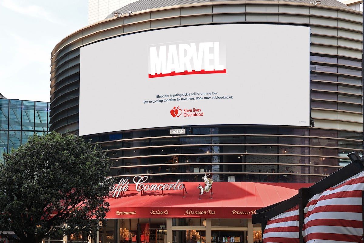
The result? The familiar logos look... wrong. The feeling that something is missing mirrored the campaign’s message: blood stocks are running low.
There’s no dramatic imagery or shocking statistics, not even the need to directly illustrate the subject matter. Just a subtle visual change that made people stop and look twice, and then work out what’s wrong with the picture.
Why does it stand out:
✅ Absence as the message: Instead of showing blood, the campaign shows that something crucial is missing. The creative idea subtly illustrates the problem.
✅ Hijacks familiarity: We know these logos so well that even a small change catches our attention immediately.
✅ Tricks you into engaging: You’re drawn into investigating what’s wrong, and therefore invested in the outcome in a way you probably wouldn’t be if you saw an ad that simply asked you to give blood.
What can we learn from this:
When we want to get across the urgency of our work for animals, it’s tempting to want to add more to our campaigns. More copy, more visuals, more evidence.
But sometimes subtraction is what creates attention.
When people already know what something should look like, removing a familiar element can be far more noticeable than introducing something completely new.
What would the countryside look like without animals, if they were all kept indoors in intensive farms? What would a restaurant menu look like if all the products that drove animal cruelty were removed? What would the average dinner plate in your country look like if the availability of familiar foods was undermined by biodiversity loss?
In short: The fastest way to make people notice something is off? Take something familiar and alter it to drive your message home.
Heads Up Challenge: Take a look at your current campaign, or a familiar object/place/thing associated with it. What’s one thing you could remove, not because it’s unnecessary, but because its absence would make people stop, notice and think?
(Copy the below into a working document that you can use for the challenge each week)
Your Brief:
Idea 1:
Idea 2:
Idea 3:
Set aside a weekly 15 minute slot to complete these weekly creative tasks and why not schedule a call with others on your team to talk through your thoughts on this topic and share ideas for you to try out?
Thank you for reading, you’re awesome!
Know someone that might enjoy Heads Up? They can subscribe here.
Looking for someone to bounce an idea off or talk about how you can use a case study in your context? We offer free one-off ‘thought partnership’ calls where we can work together on your current challenges or queries. Reach out at hello@campaignslab.org